Front-end Web Dev Crash Course Part 4/4
javascript
html
css
This is part 4/4 notes of a Youtube Front-end web development crash course.
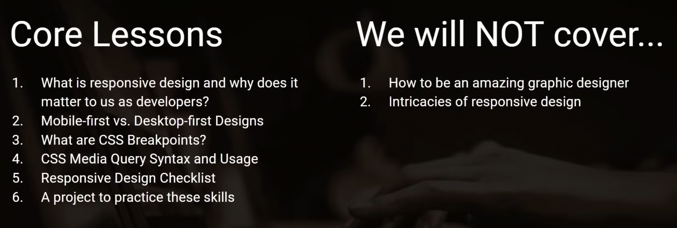
Lesson 23
Video timestamp: Frontend Mentor CSS “Pricing Card” challenge
Lesson 24
Video timestamp: Introduction to responsive web design
Responsive Web Design
- If a user hurt their eyes looking at your webpage – you are not designing reponsibly & your webpage is not responsive.
- Rule of thumb:
- Body of text needs to generally be 700px, in the middle of the screen, and narrow enough for your eyes not to have to move great distances to read it. It should not be the full length of a desktop device.
- Content must be full width on mobile screen. You don’t want them in 2 columns.
- Navbar and links should not be overlapped.
- Navbar should not be on the very edges of the page, should be center align with the content of the webpage.
- If page width is narrower than the length of navbar links, then have the navbar links be in dropdown of a navigation menu.
- Mobile-first vs Desktop-first web design:
- Mobile-first vs Desktop-first has nothing to do with the design phase but has everything to do with when you start writing the CSS and when you put together the breakpoint (breakpoint = where the desktop webpage convert to mobile webpage)
- Media query with CSS
- Breakpoint - Eg if you want a breakpoint at 600px, then as the width of the screen gets bigger or smaller than 600px, you want to have different CSS rule for both of them.
- In general,
- Mobile device will be somewhere in the range of 320px - 480px wide.
- Tablets have between 600px - 800px wide.
- Normal size latop between 1024px - 1440px wide.
- Big desktops is around 2500px wide.
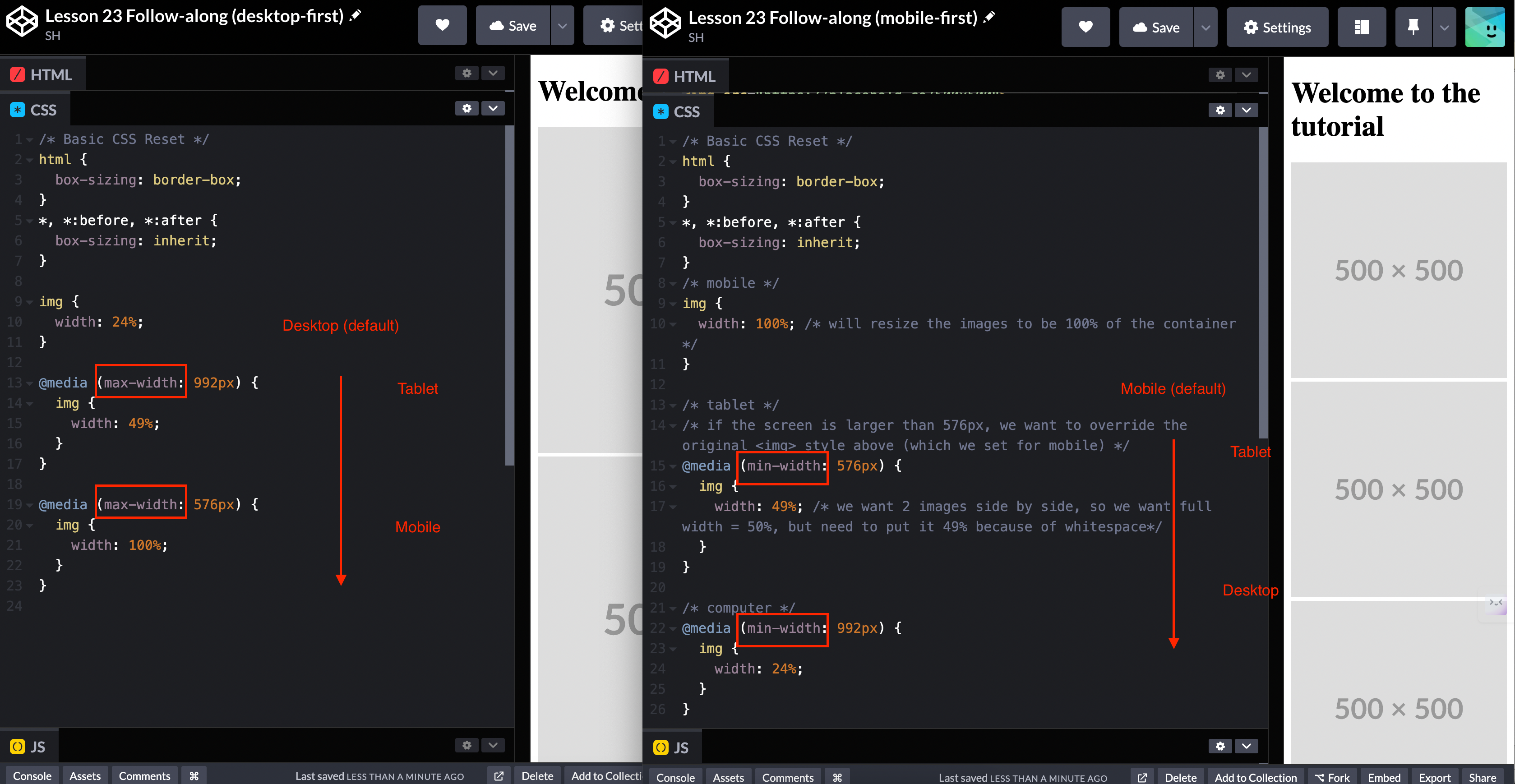
- In mobile-first design, all the default CSS rules are for mobile, and we use
min-widthcondition when specifying media query. We specify the media query from small screen –> large screen. With mobile being the default. - In desktop-first design, all the default CSS rules are for desktop, and we use
max-widthcondition when specifying media query. We specify the media query from big screen –> small screen. With dektop being the default. - The concensus in dev community is to do mobile-first design because mobile design will most likely look good on a desktop, whereas desktop design would most likely not look good on a mobile.
- Below is comparison between mobile-first and desktop-first CSS rules.
3 questions for deciding breakpoints
- Will this webpage be used on a mobile device often?
- If you know the webpage will not be used much on a mobile device, then you should not waste your time designing a pleasing mobile experience. You should just tell your users to use the application on desktop.
- Are you providing a mobile application, then you don’t need to put quite as much time and thought on how it looks on different screens.
- Is a detailed mobile, tablet, desktop design important?
- If you have just a basic website with some text on it and not a lot of images, then it may not be that important to have a bunch of breakpoinst. You might be able to get away with one design for all devices and it’ll work just fine.
- Are there breakpoint “standards” we can use?
- Screen sizes are constantly changing as new physical device are released to the world, so there are not much industry standards that we can use.
- It is a good idea to piggyback on frameworks for breakpoints because the developer of these frameworks had done a lot of thinking on breakpoints, in order to incorporate breakpoints into the framework.
- Writing breakpoint rule:
- Syntax: with logical operators
@media only screen and (condition1) and (conditionN) { your CSS rule here }- Syntax: without logical operators
@media (condition) { your CSS rule here }- For example below, we set breakpoint rule for screen between 400-600px to change the color of
<h1>tag to red.
@media
    only screen
    and (min-width: 400px)
    and (max-width: 600px)
{

    h1 {
        color: red;
    }

}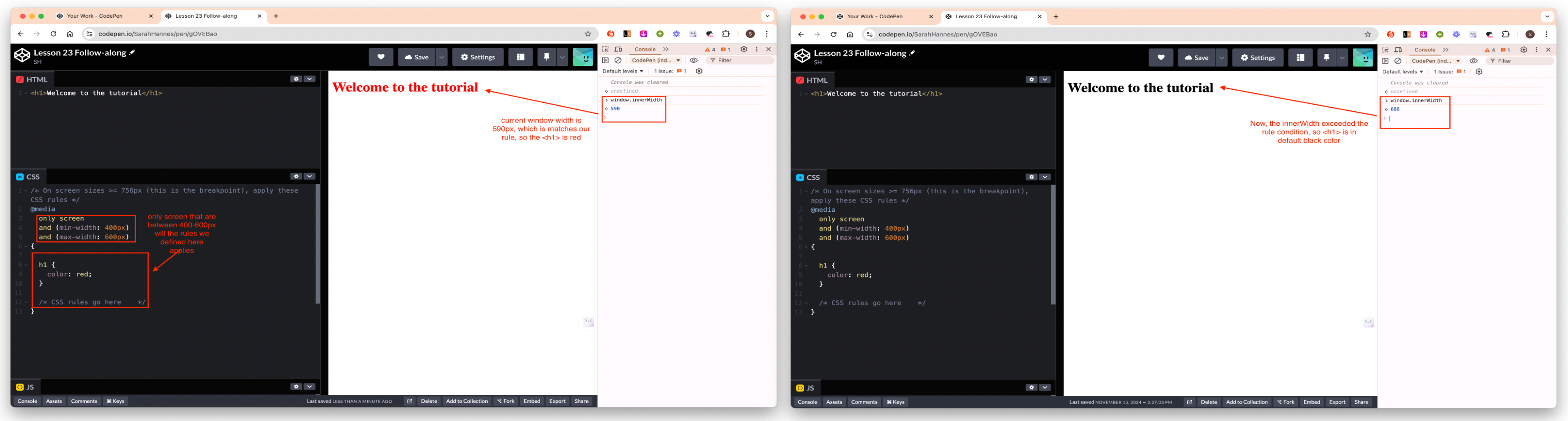
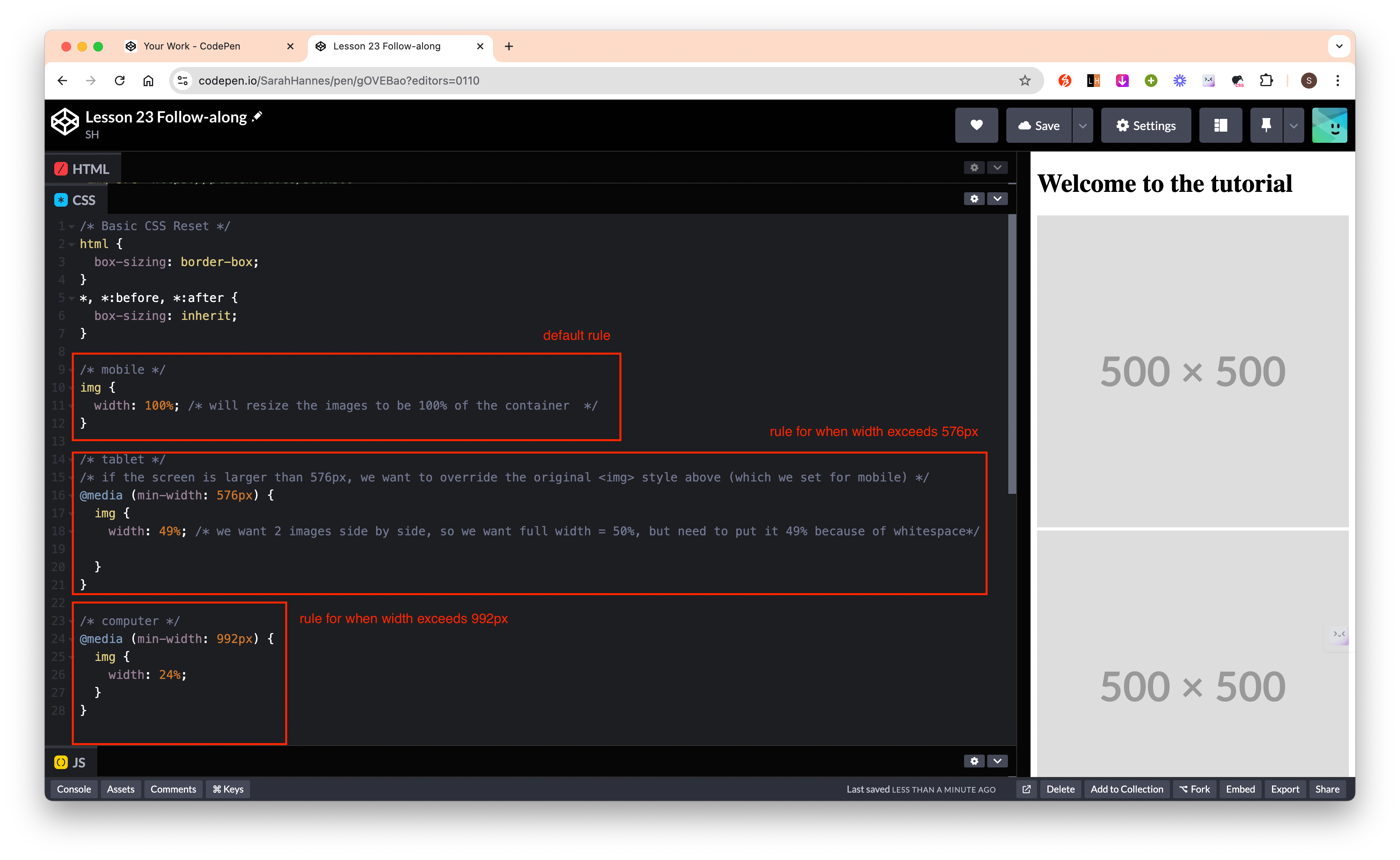
image.png - The order in which we define the breakpoint matters (should place rules for the biggest screen size at the bottom most – if we’re using mobile-first approach ie setting condition using
min-width).- This is because CSS is read from top to bottom.
- So what will happen is, the default rule is read, and img are set to 100% of the width. Then it continue on reading the next rule which says if the width is greater than 576px, then make the img to be 49%, so it will check the width and resize. Then lastly it reads the last rule and check the width and resize if needed.
- If we put the rule for
min-width: 992pxon before the rule formin-width: 576px, then even say the window size is 1000px, the last rule ofmin-width: 576pxstill applies, because 1000px > 576px, and so it will apply the last (most recent) rule it reads.
 - We should always place the media query
 @media at the very bottom of the CSS stylesheet otherwise our media query will be overrode by the default CSS style we set. - The only thing we need to take care of when writing media query is layout related properties, everything else (eg color, fonts, background images etc should stay the same, so we don’t need to rewrite all CSS rules).
Tips
- You should separate the design phase and coding phase when you are building website. You don’t want to get into situations where you’re trying to design something and code it at the exact same time.
- Before you write any code, have a basic visual representation of what you’re trying to do.
- At least have wireframe design – the goal of wireframe is just to get a general idea of where elements should be arranged based on the size of the screen.
- You can do mockup in Figma.
- Differences between wireframe vs mockup?
- Wireframe doesn’t care about the colors, font. It just take care about the layout of the page.
- Mockup is full representation of what you’re trying to do.
- What to do when you don’t have any design skills? There are 3 options:
- You can hire a designer and have them design for you
- Browse the internet for free designs
CSS Frameworks
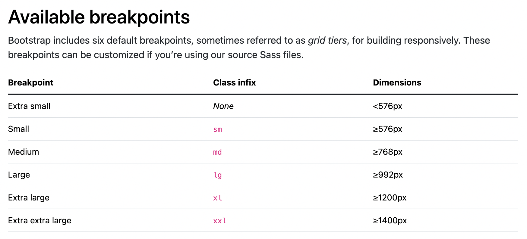
- Bootstrap is a long-standing CSS framework.
- Has standard set of breakpoints.
- Bootstrap is mobile-first: we are first designing the CSS for a mobile device. Below is the standard breakpoints for Bootstrap.
Reference
- Screen Siz.es: Viewport sizes of various devices.
- Bootstrap/Breakpoints: Bootstrap documentation avaialble breakpoints
- MDN/At-rules: CSS statements that instruct them how to behave, we use this to define breakpoint rules
Lesson 25
Video timestamp: CSS Flexbox Crash Course
Flexbox
- CSS properties can be grouped into 2 categories:
- Layout related properties
- This is what we use to create navbars, footers, sidebars etc
- Style related properties eg color, font
- Layout related properties
- Flexbox and CSS Grid provide us a better model for doing layouts so we don’t have to hack our way in order to make items fit into containers (like we’ve done previously having to delete whitespace from our HTML code).
- What is Flexbox:
- a layout model for displaying items in a single dimension - as a row or as a column.
- What is CSS Grid:
- A 2-dimensional layout model within CSS
- Default block container vs Flexbox:
- Default
display: block;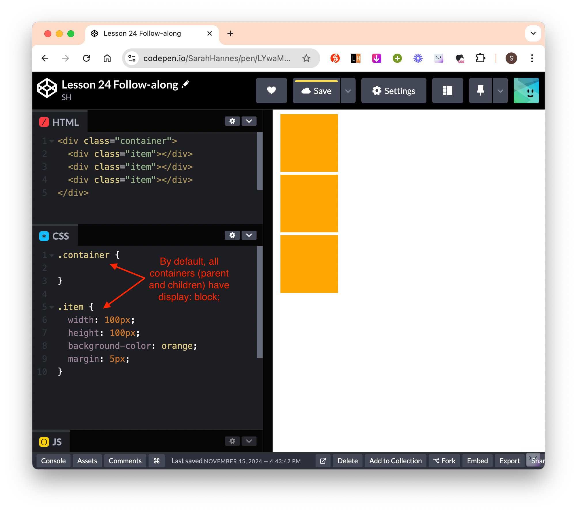
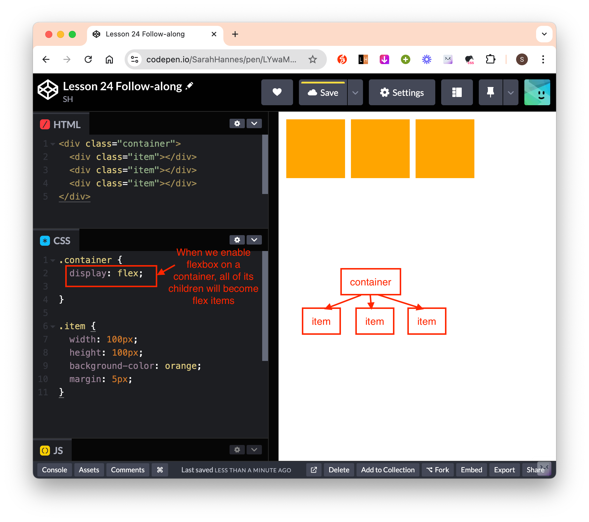
- Flexbox enabled on parent container -> Now the parent container become flex container and all children become flex items.
- When we turn a container to a flex container, only its direct children will become flex items (not all of its descendents). This is shown below where the third flex item’s children is of default block display and not flex items. (We know it is of display block because they all aligned on a new line each, and also we can confirm that we did not set
displayproperty to its parent – so the defaultdisplay: block;is applied here)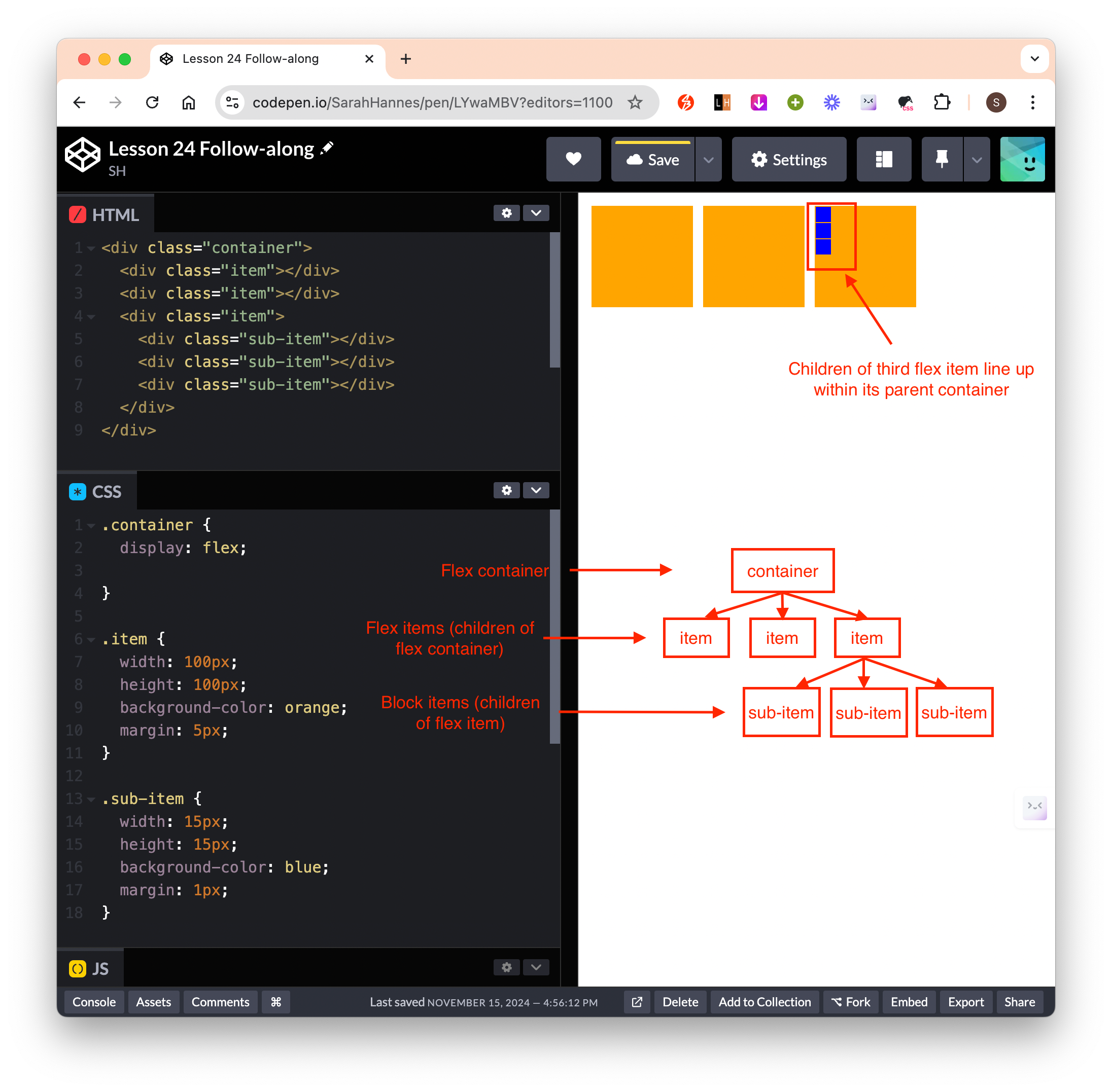
- To turn the children of the
#item-3to be flex items, we target#item-3and give itdisplay: flex;property. Now we can see that its children line up next to each other. Notice that now#item-3is both a flex item (because its parent is a flex container) and also a flex container (because we setdisplay: flex– therefore its 3 direct children#sub-itemare all flex items.)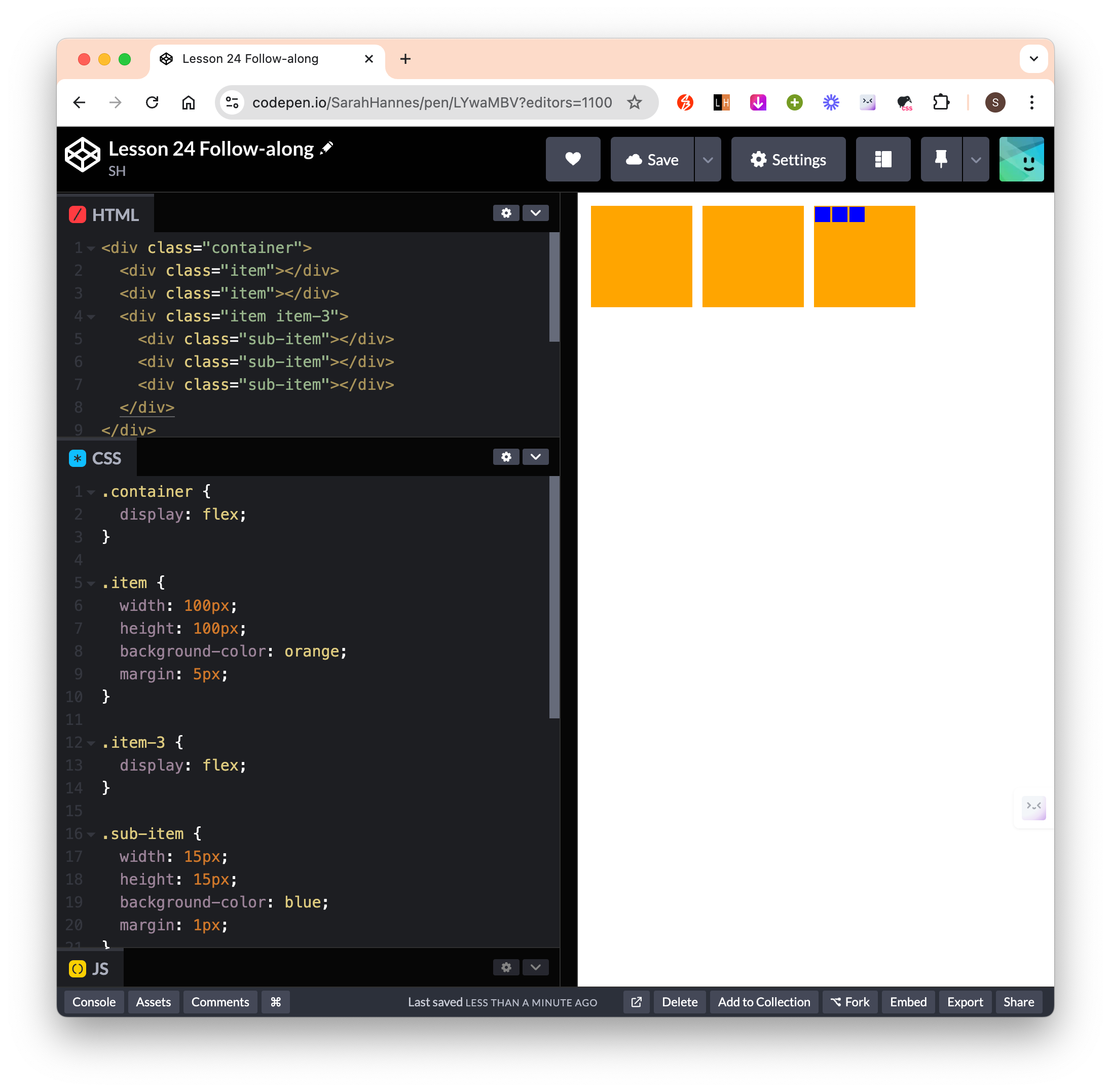
- It is important to know if the container we’re dealing with is a flex container or a flex item. And that in some cases, an element can be both a flex container (with respect to its direct children) and a flex item (with respect to its parent) at the same time.
- In reality, as soon as we set
display: flex;, it sets a bunch of properties that comes with flexbox by default – it is important to be aware of this because this essentially changes the way our containers will behave.
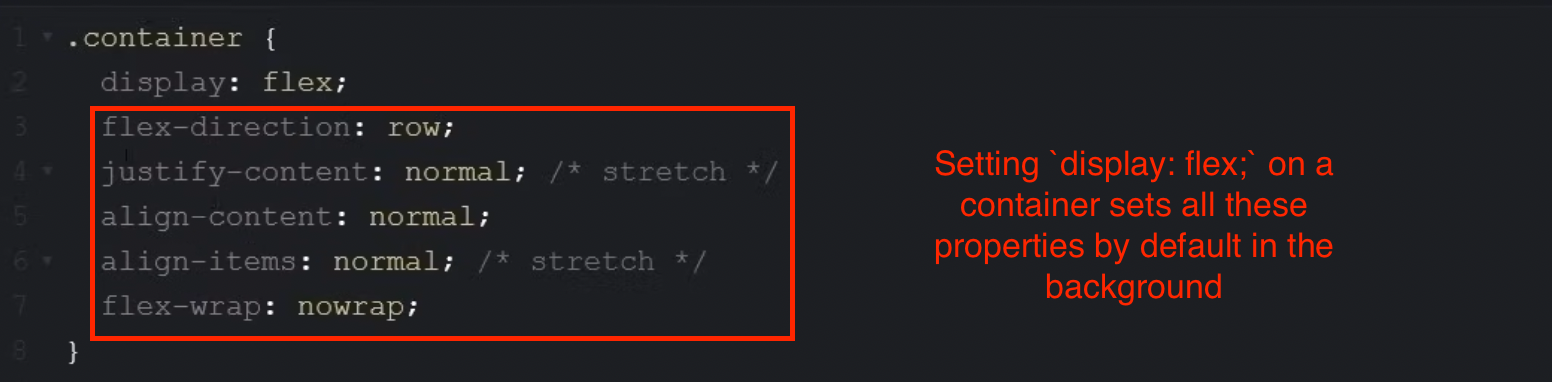
image-5.png - Default properties of a flex container. All below properties will be automatically set (to a flex container) when we set
display: flex;to itself.
flex-direction: row; justify-content: normal; align-content: normal; align-items: normal; flex-wrap: nowrap;- Default properties of a flex item. All below properties will be automatically set (to a flex item) when we set its
display: flex;to its parent.
align-self: auto; flex-grow: 0; flex-shrink: 1; flex-basis: auto;- Flex shorthand
flex: 0 1 auto; /* is equivalent to */ flex-grow: 0; flex-shrink: 1; flex-basis: auto; - When we turn a container to a flex container, only its direct children will become flex items (not all of its descendents). This is shown below where the third flex item’s children is of default block display and not flex items. (We know it is of display block because they all aligned on a new line each, and also we can confirm that we did not set
- Default
Flex Container Properties
display
display: flex;: convert a contrainer into a flex container and all its direct children into flex item(s).
flex-direction
- define what we’ll be using as main axis and (subsequently what we’ll be using as cross axis)
flex-direction: row;is the default value. Ifrowis chosen, each of flex item will be align on a new column each (so per flex item is spread across row).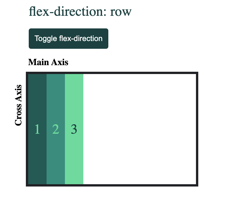
- If
columnis chosen, each of the flex item will be align on a new row each (append downward, so per flex item is spread across column).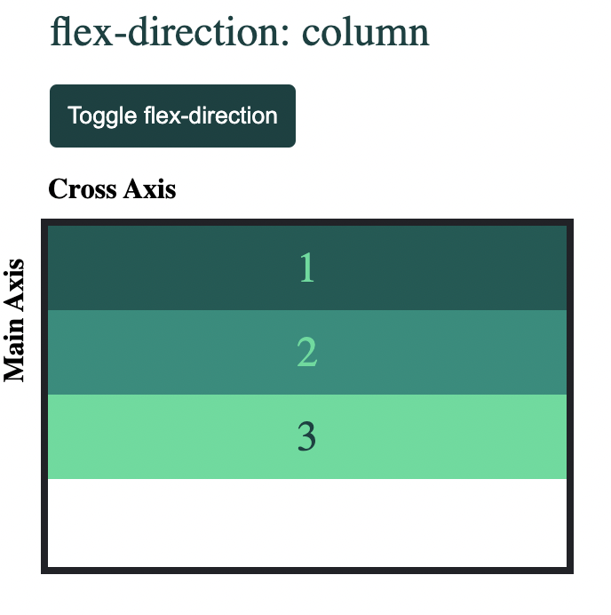
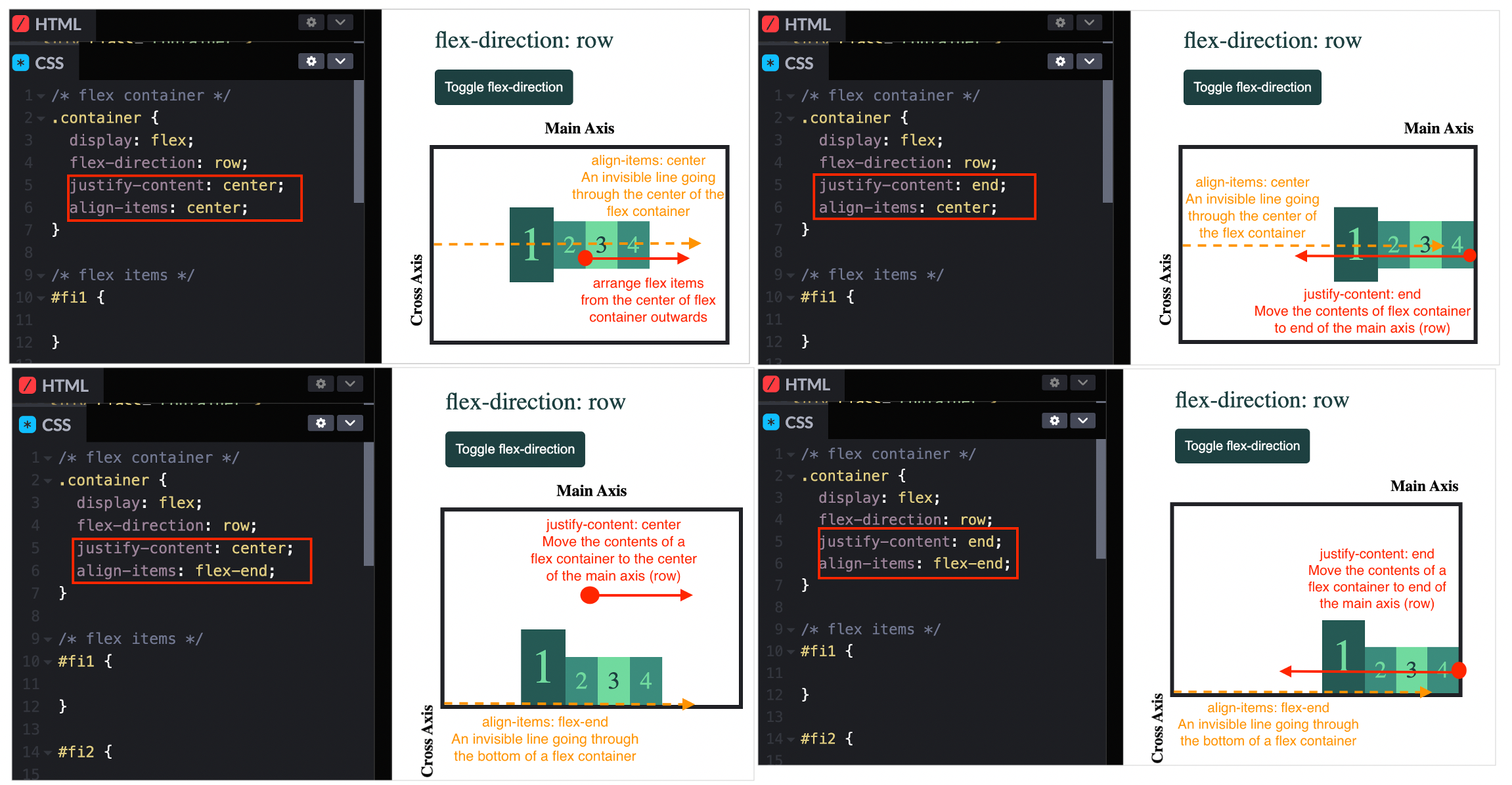
justify-content
- Tells us how the flex items are spaced-out and aligned on the main axis.
justify-content: normal;is the default value. Make all the content of a flex container to be justified from the start of flex container (left hand side forflex-direction: row). We can achieve the same setting withjustify-content: start;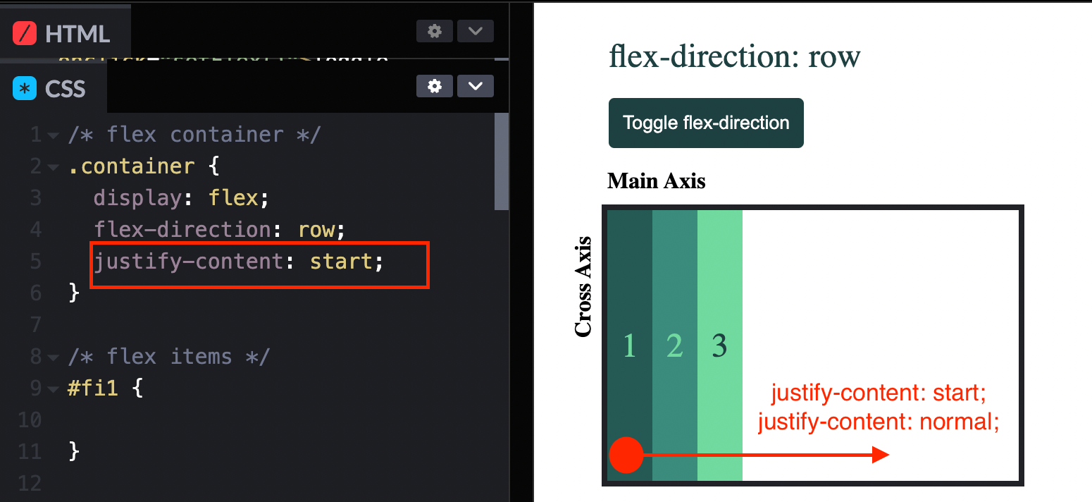
justify-content: end;will make all the content of a flex container to be justified from the end of a flex container (right hand side forflex-direction: row).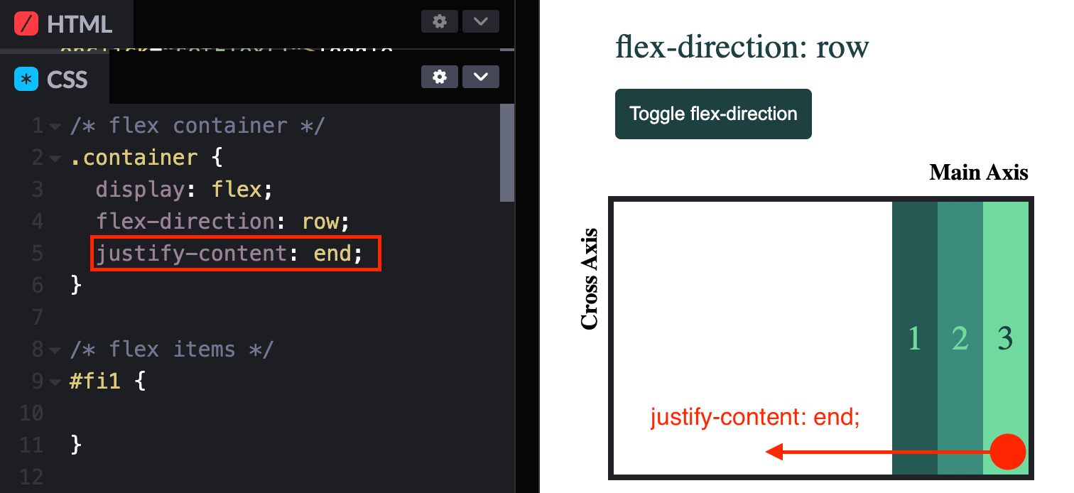
- If
flex-direction: columnis set, thenjustify-content: startwill be from first row, andjustify-content: endwill be from the last row.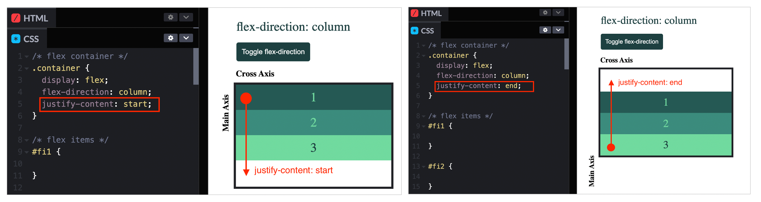
justify-content: centeraligns the flex items from the middle of the parent container.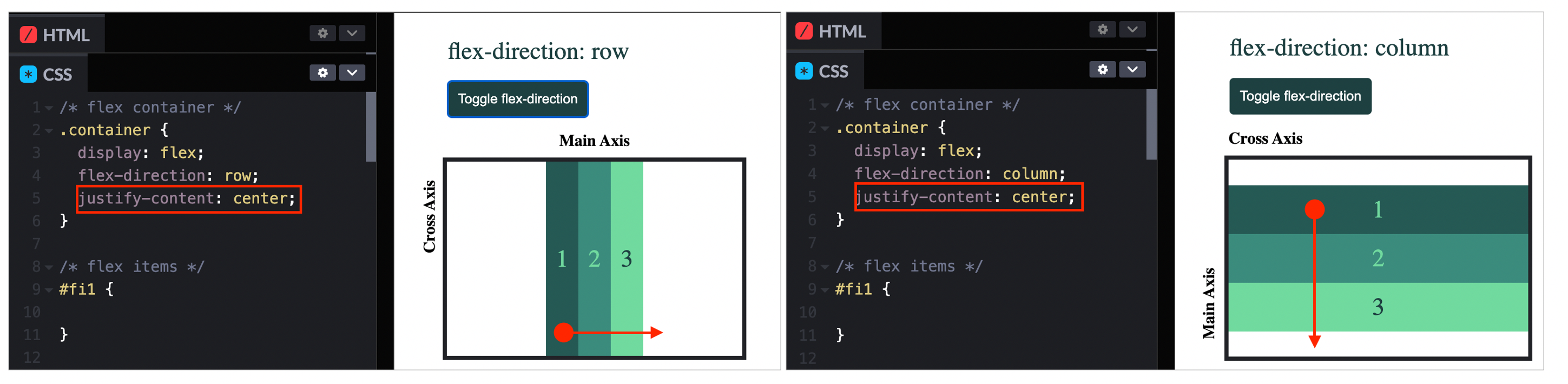
justify-content: space-betweenputs whitespace in between flex items.justify-content: space-aroundputs whitespace surrrounding flex items.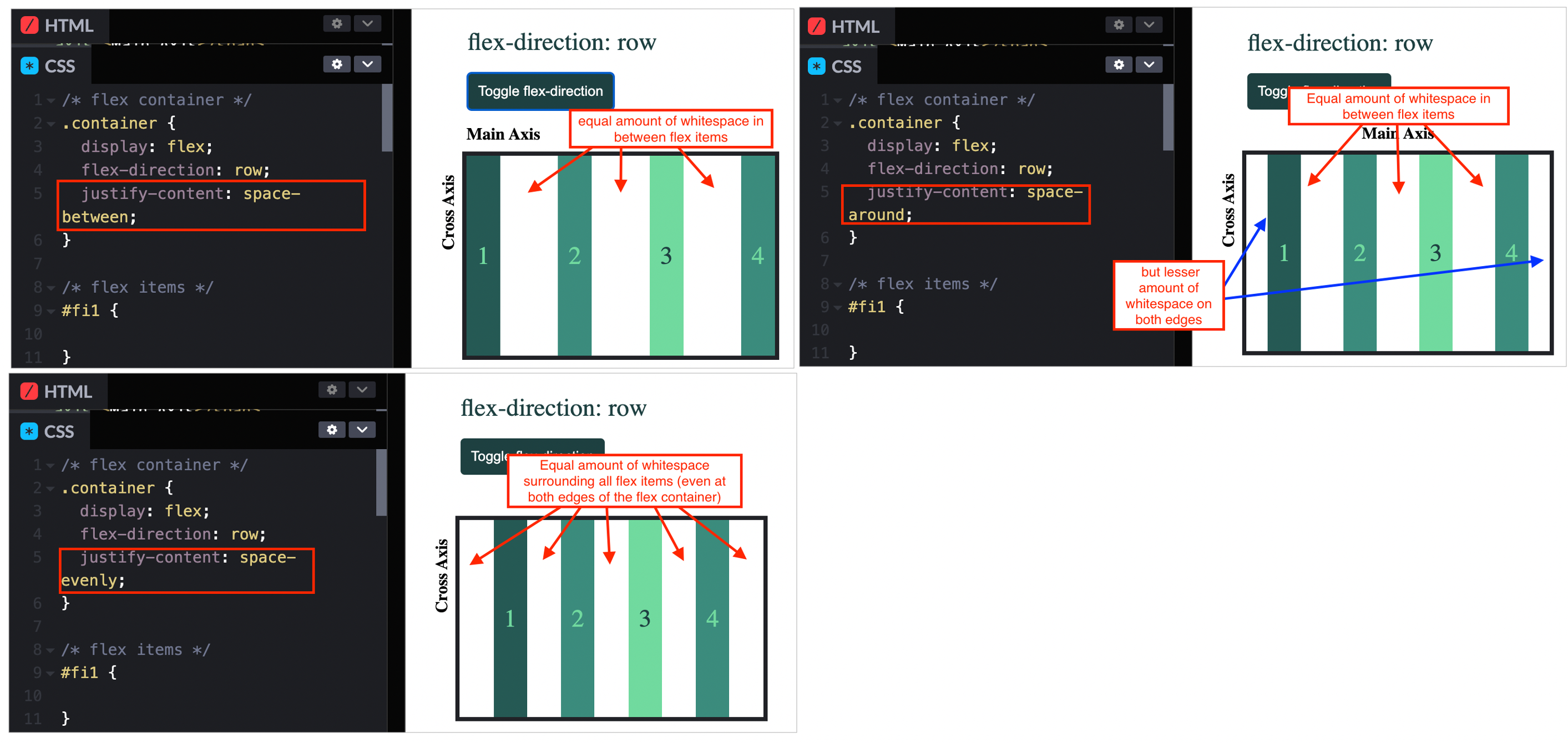 ### align-items
align-items: normal;is the default value. When applied to flex container, both of these are the samealign-items: normal==align-items: stretch. Thisnormal/stretchstretches the height of flex items to be the total height of the flex container (unless you have specific heights set on the flex items already). Flex items respect width and height if we already set it - so long it does not overflow from the flex container.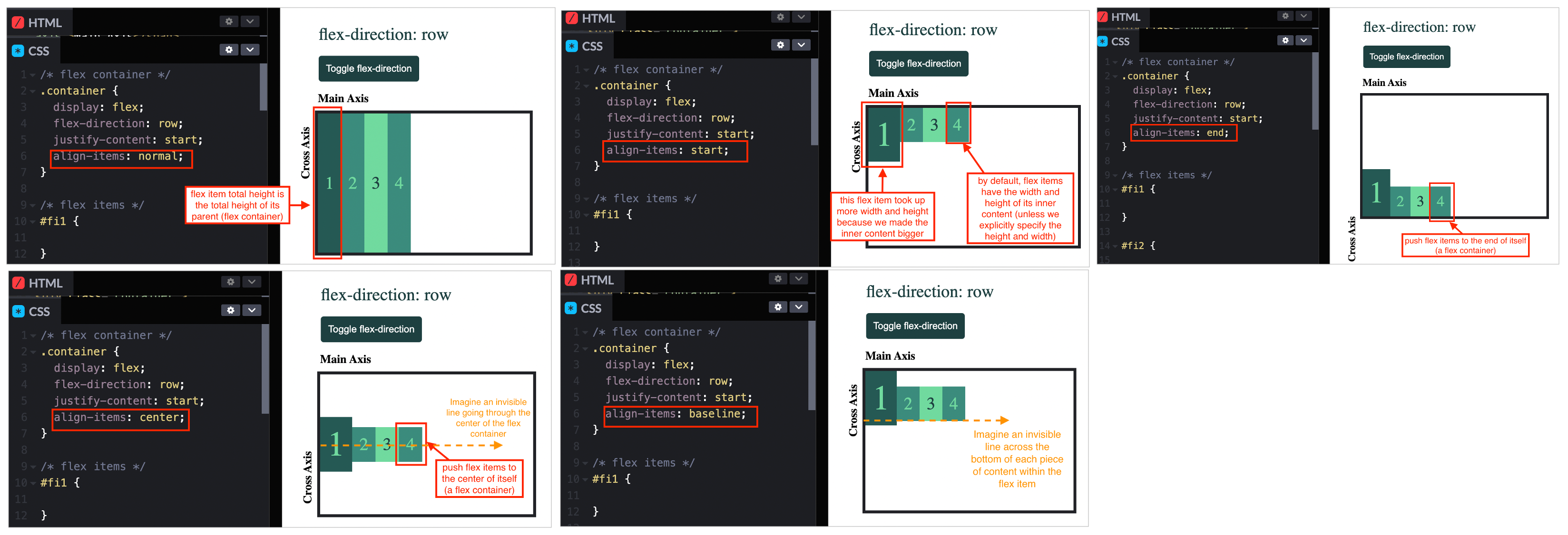 ### flex-wrap
- Imagine we have this problem where our flex items are overflowing out of our flex container. We have 2 options to fix this:
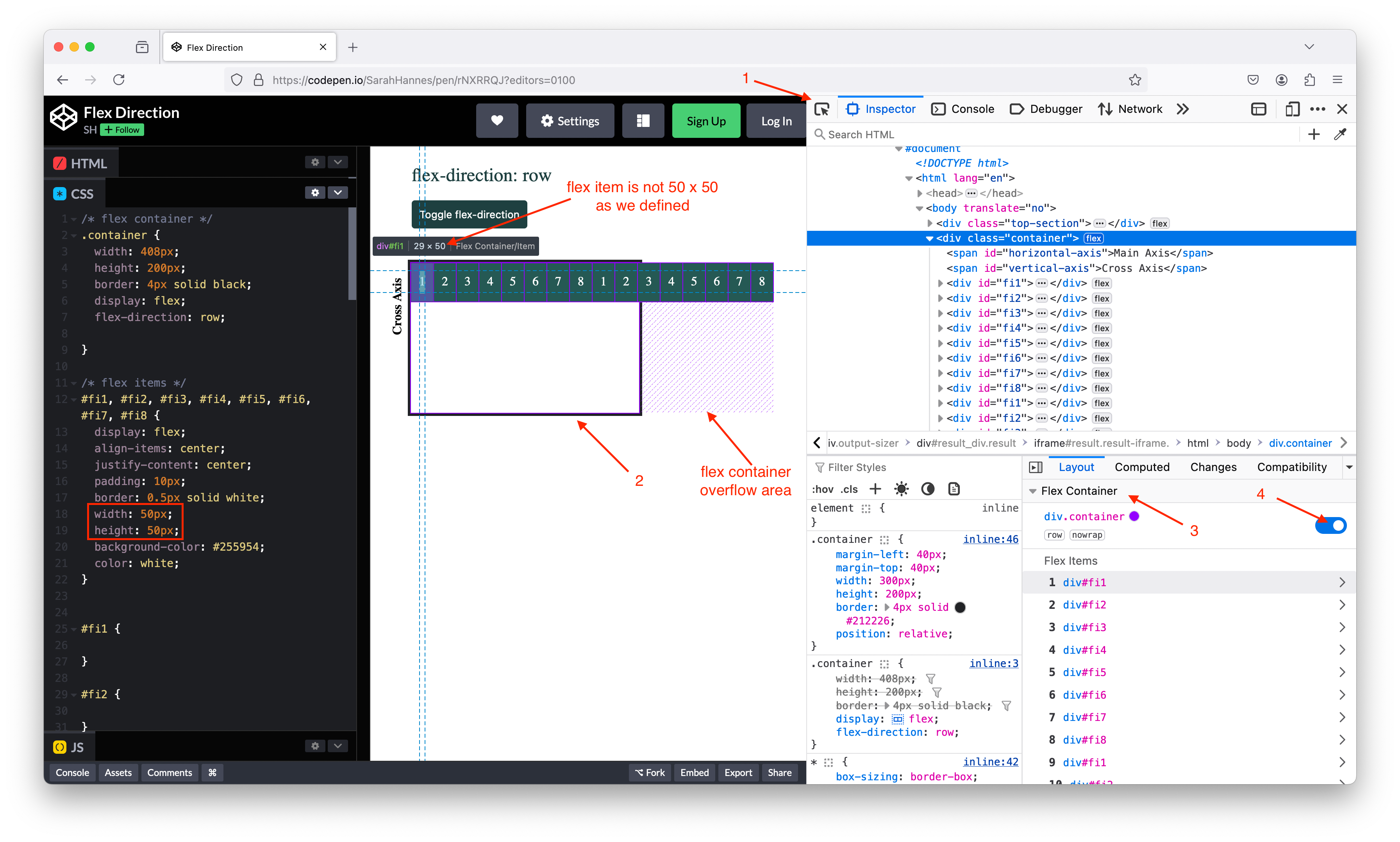
- Set
overflow: auto;. This is a generic solution that can be used with any display type (not onlydisplay: flex). This will give us a scrollbar.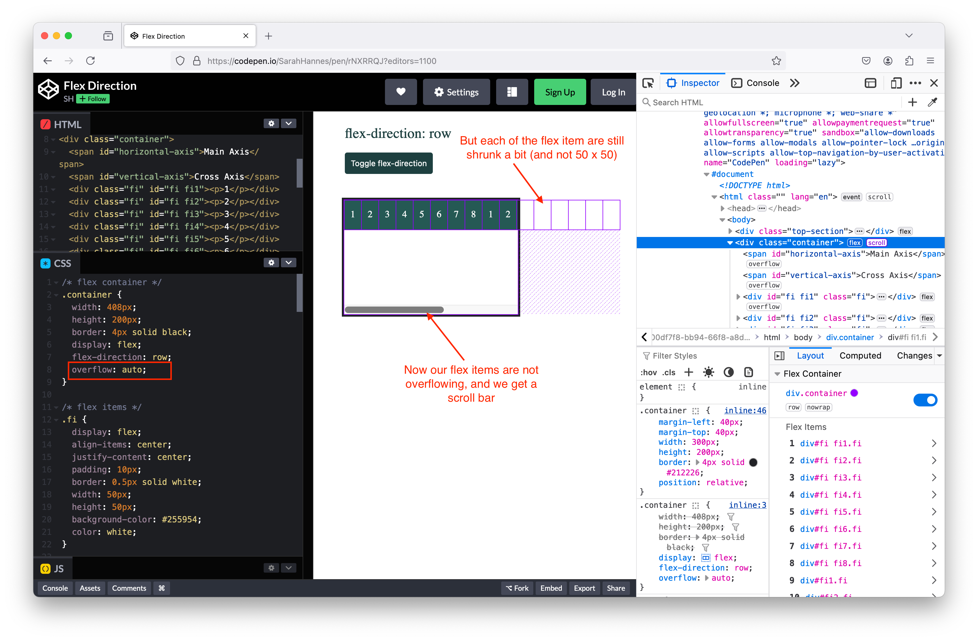
- Set
- Set
flex-wrap: wrap;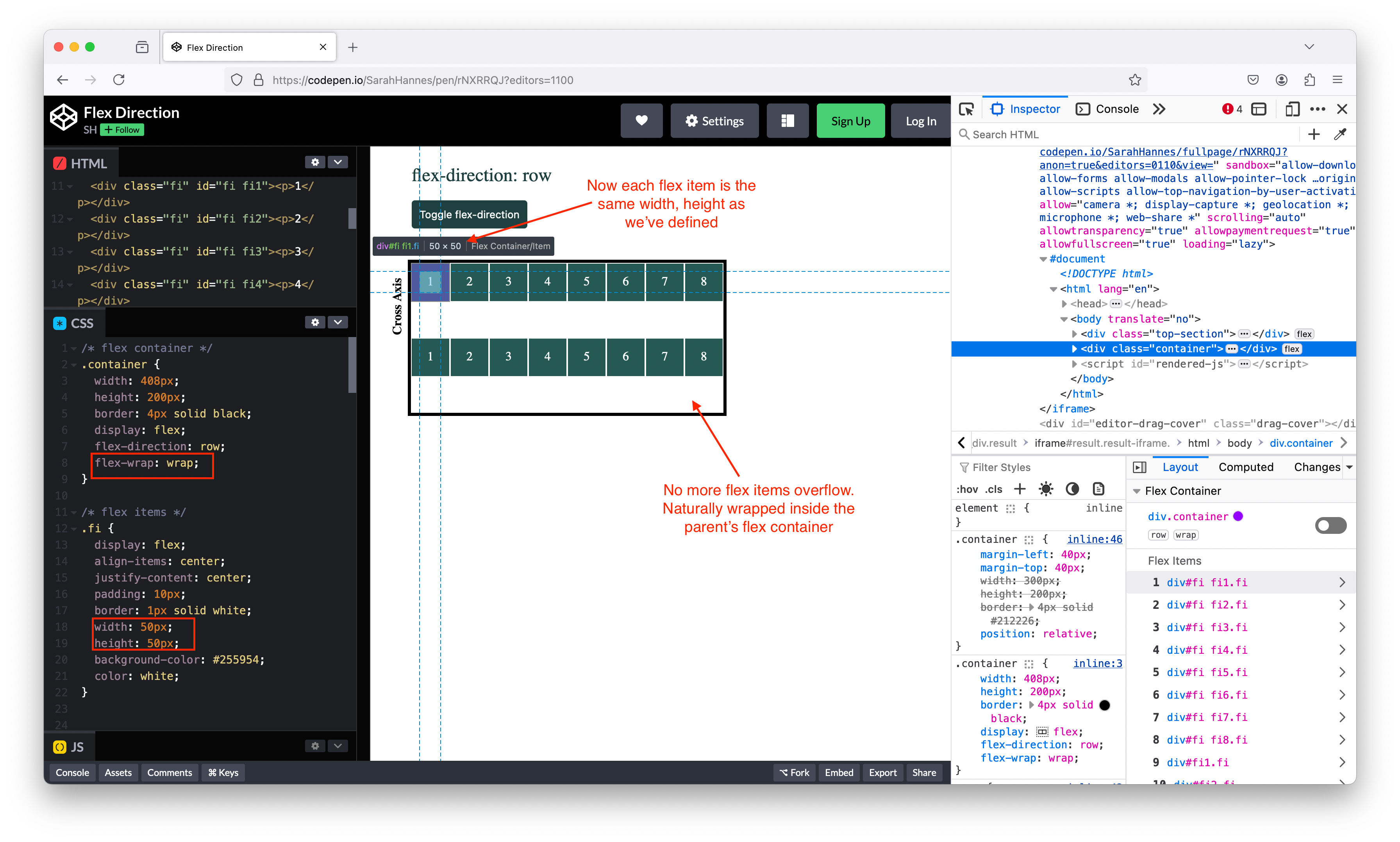 ### align-content
- Set
- Use this property when we want to align (group of) wrapped flex items. This should have the similar behaviour as
align-itemsbut when we setflex-wrap: wrap,align-itemsno longer work on grouped wrapped items. We have to usealign-contentinstead. Eg below isalign-content: flex-start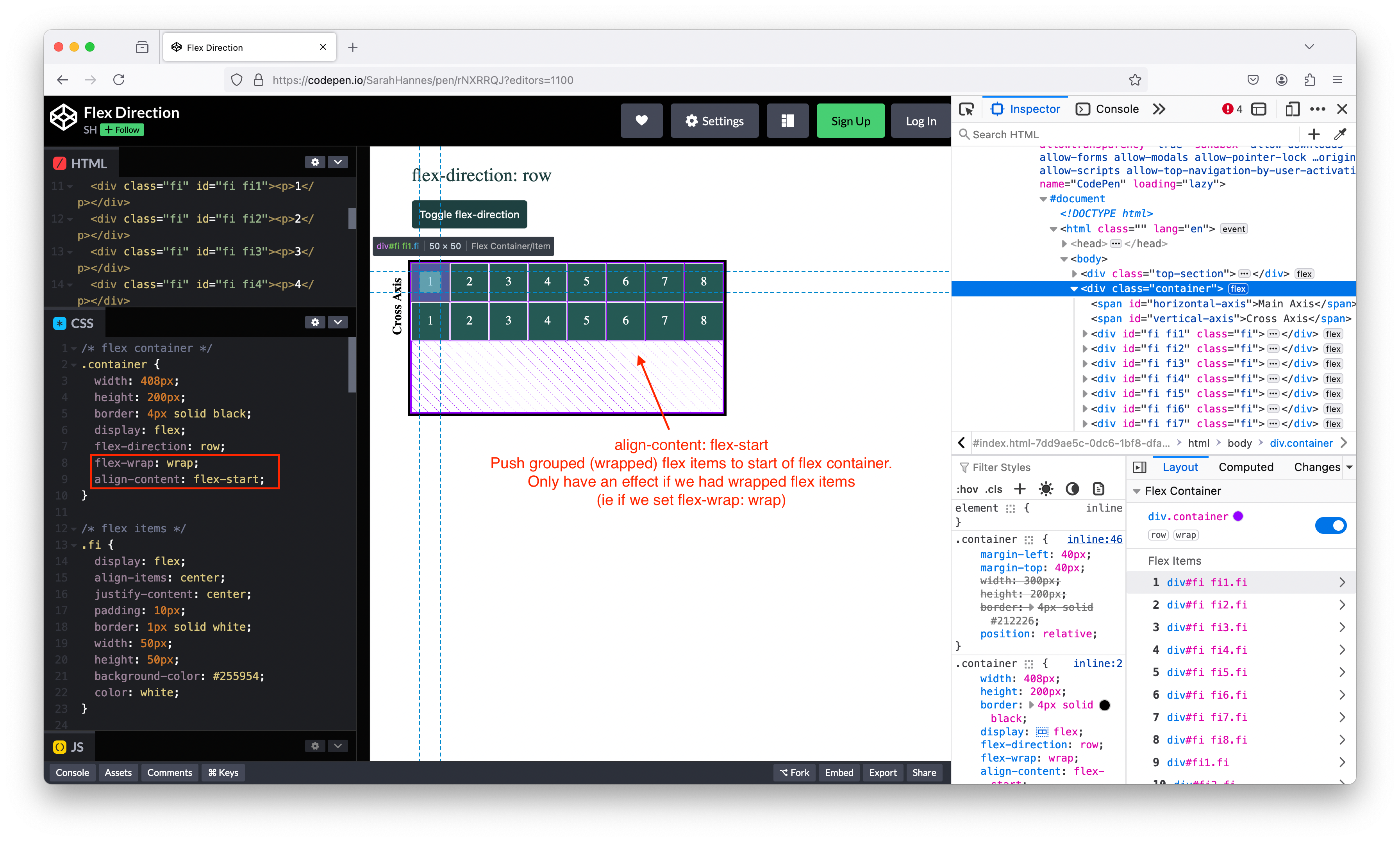
align-content: center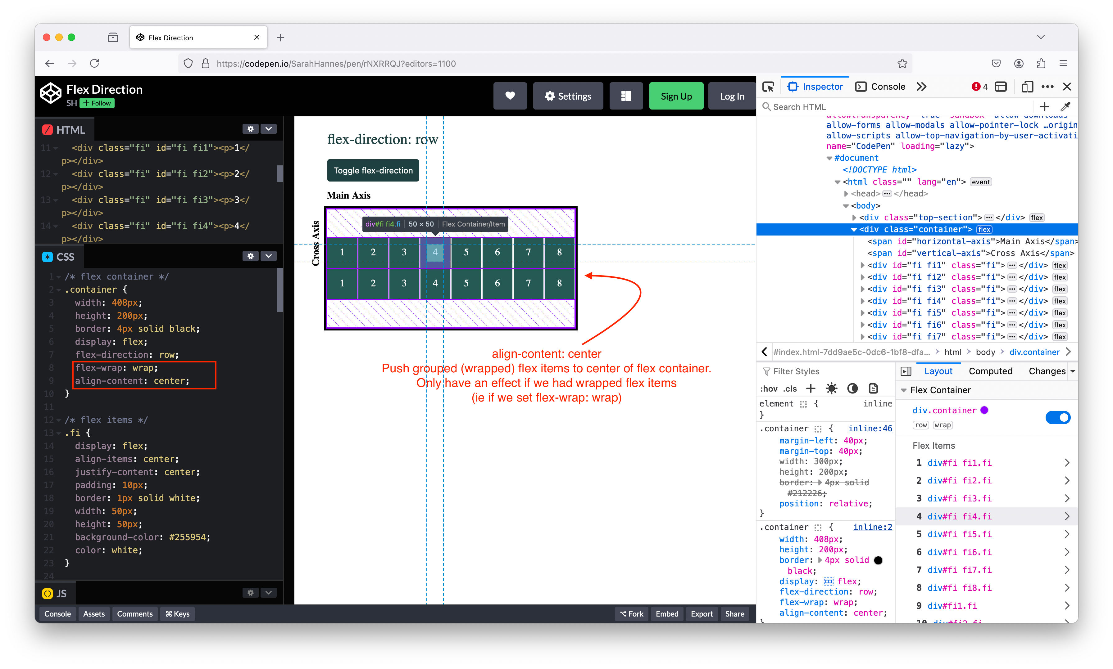
Overview
- Relationship between justify-content + align-items
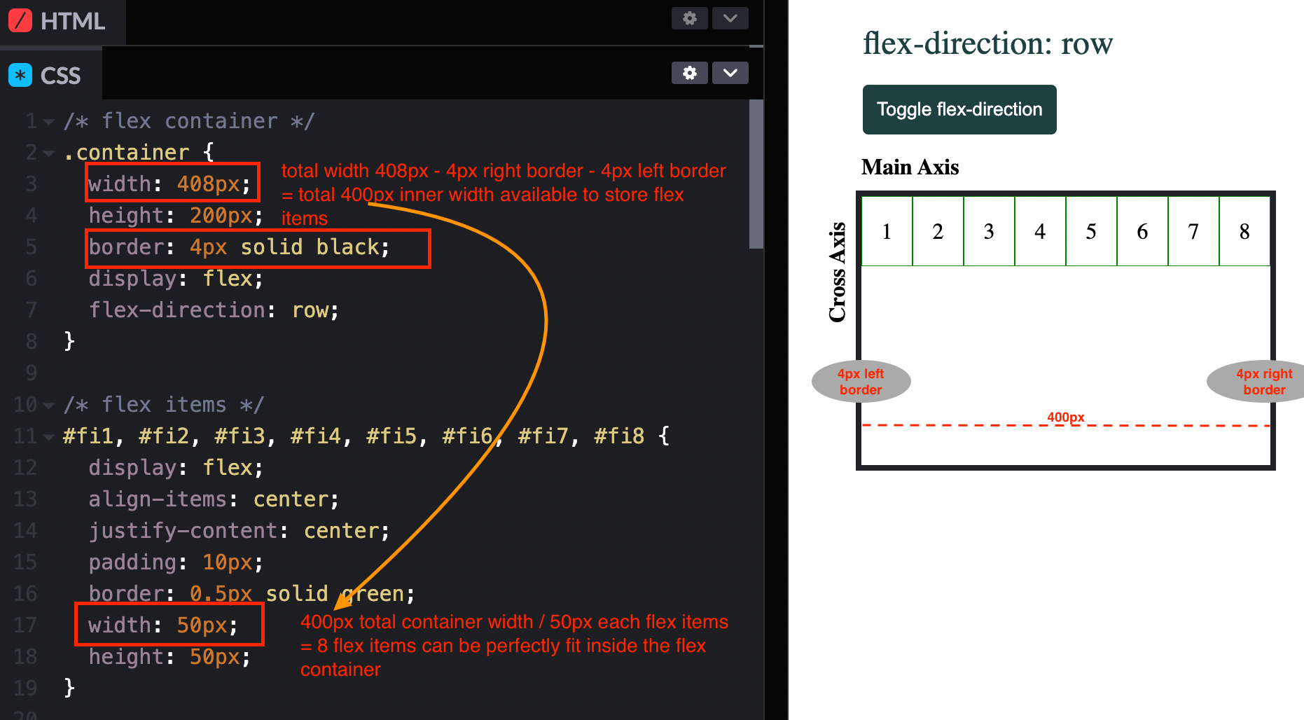
- How to calculate how many flex items can fit inside a flex container
Flex Item Properties
- By default, the width of a flex item is determine by its inner content, and its height is stretched to be equal to the total height of its parent (a flex container). ### align-self
- Same as
align-itemsbut act on a single flex item instead of the whole container of flex items. - Default value is
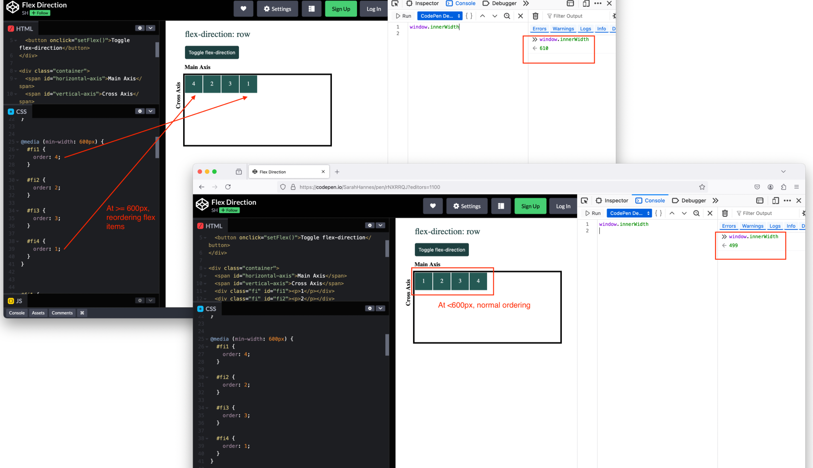
align-self: flex-start;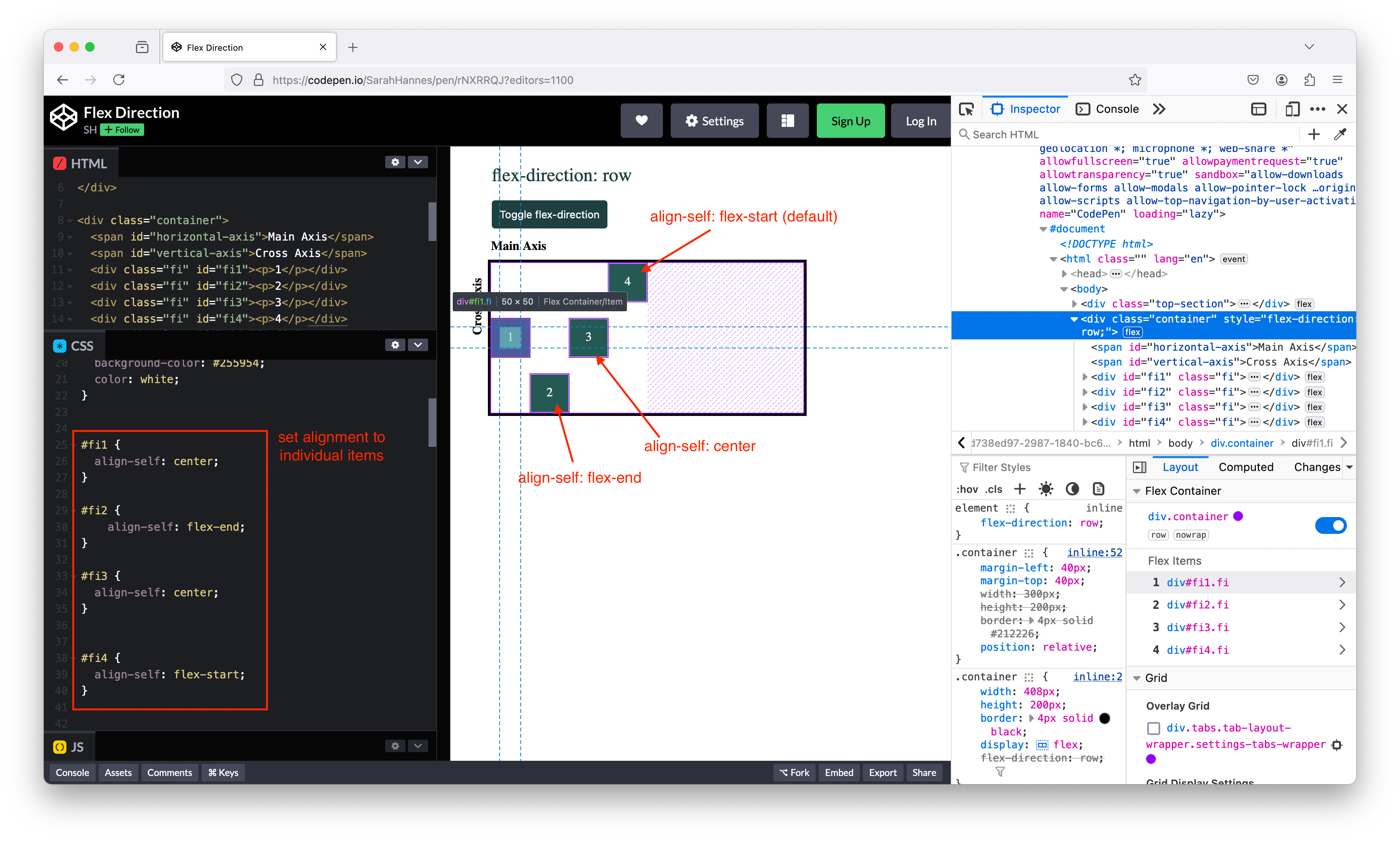 ### order
 - To rearrange the ordering of flex-items, we can directly do it in CSS without having to change the ordering from HTML
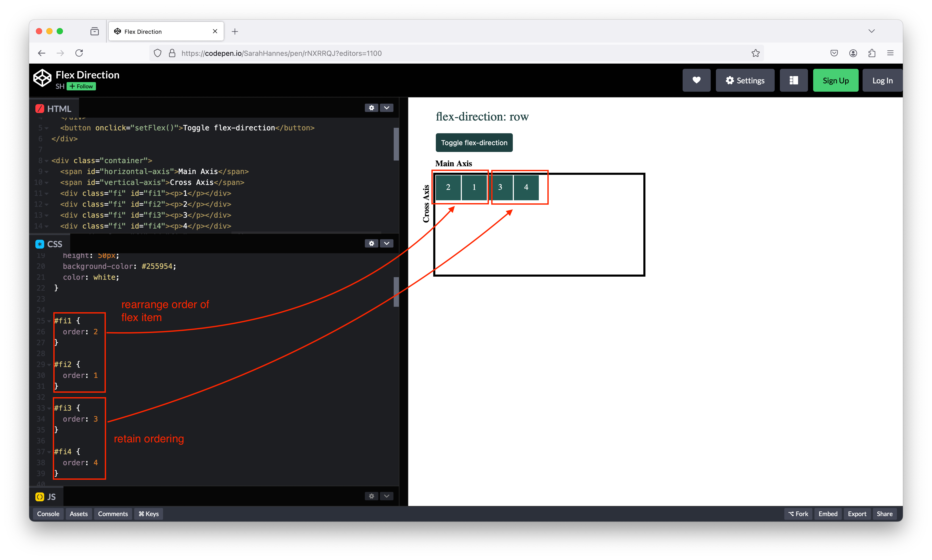
- Might be useful when you design responsive webpage, eg as user resize the page, you may want certain element to be in certain order, eg you have sidebar, navbar, header, footer – maybe you want to order them differently depending on whether you’re on a desktop or mobile device.
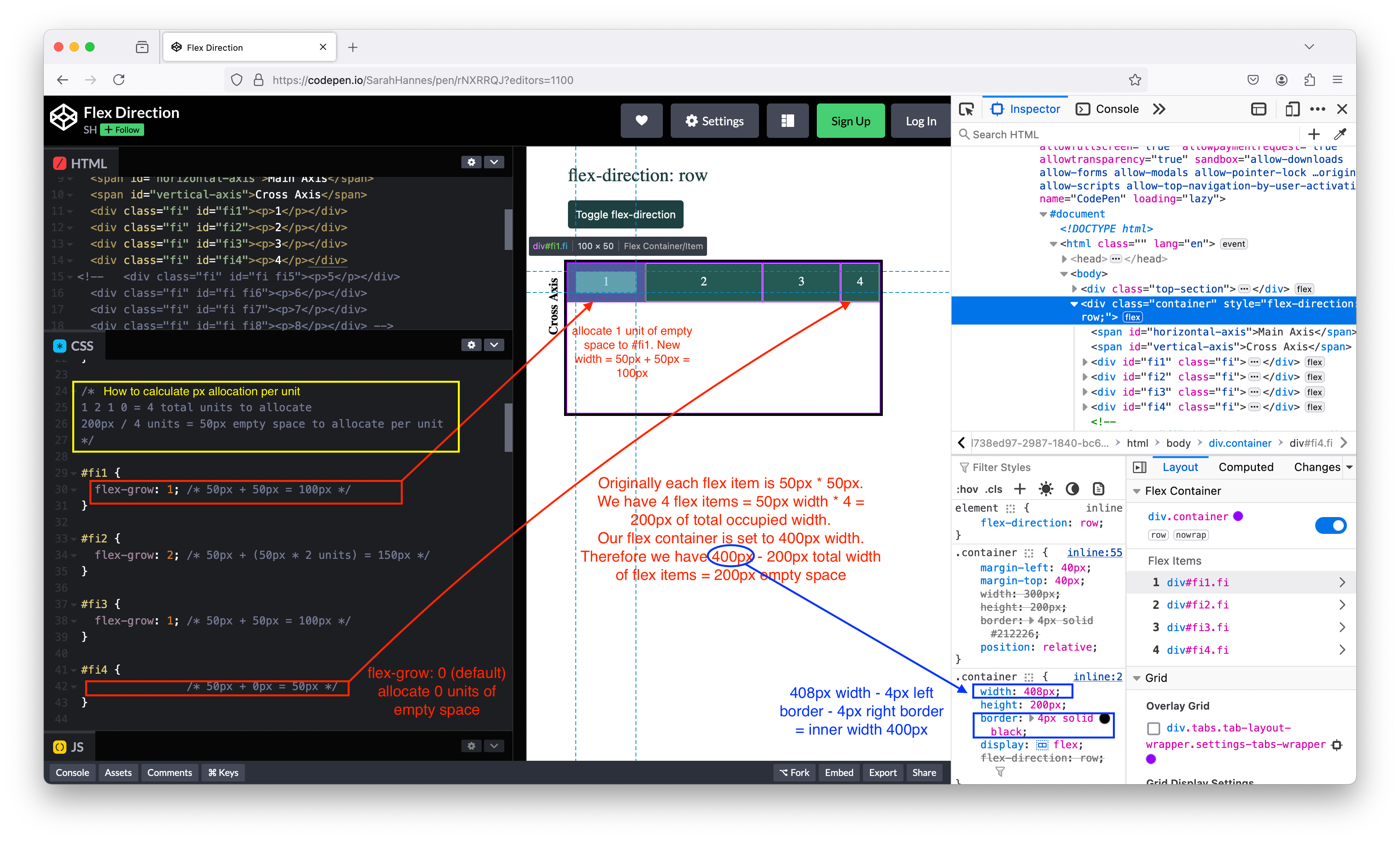
 ### flex-grow
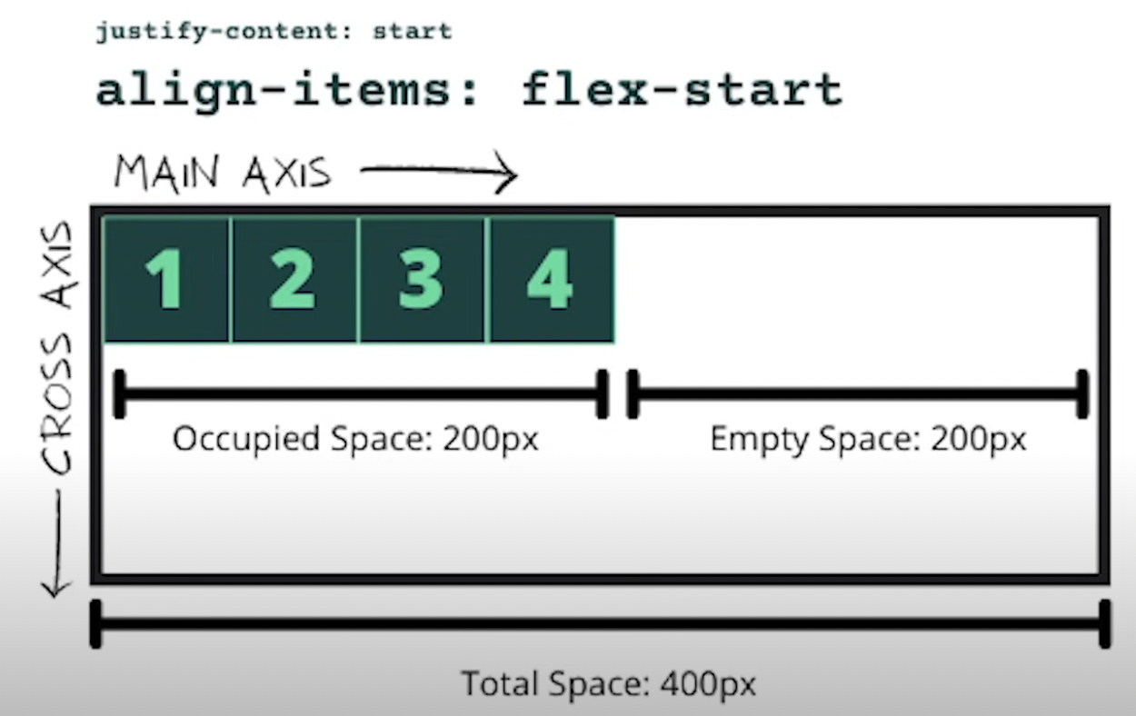
- Use flex-grow to allocate empty space to flex items
 ### flex-shrink
 - Use flex-shrink to shrink overflow width from flex items
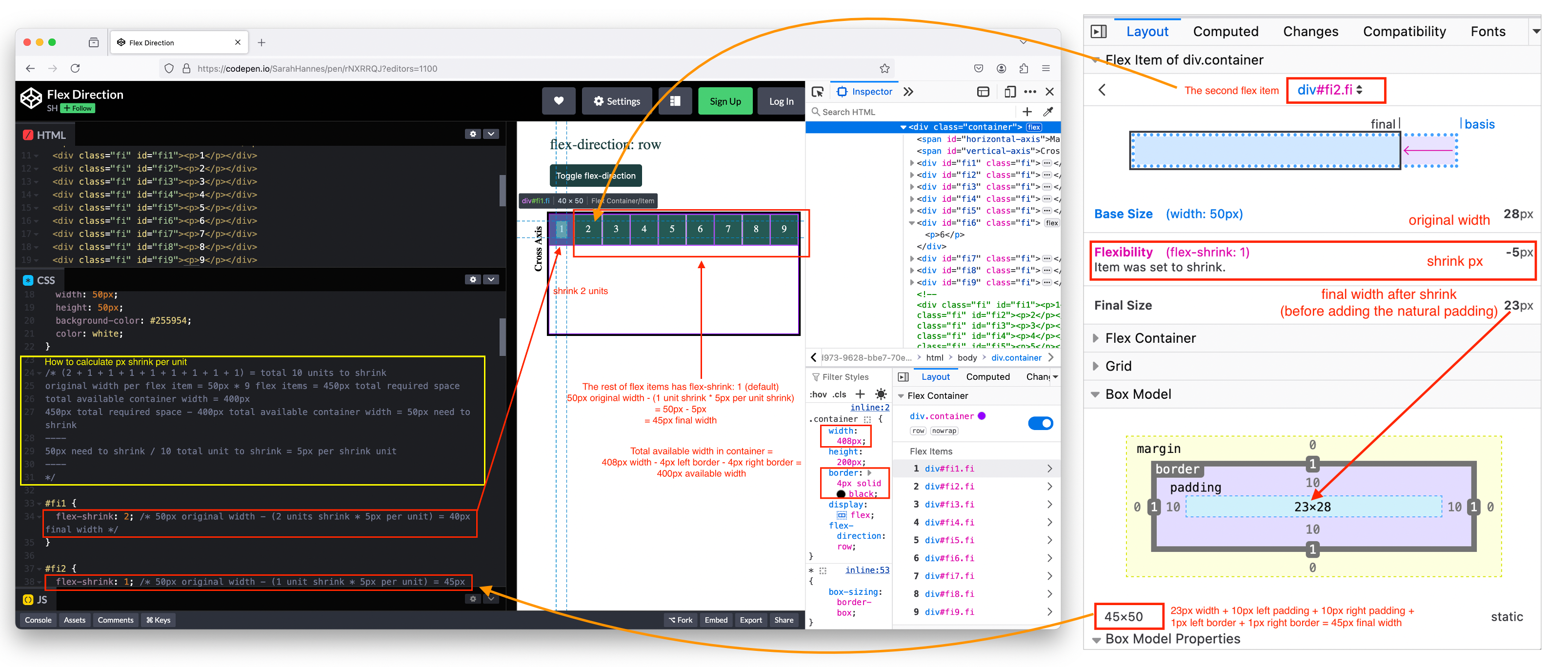
- Flex item can only shrink up to a certain cut off (usually happened when px to shrink exceed minimum required px of a flex item.)
- To have flex item retain their original width (no shrinking), we can set
flex-shrink: 0which is not the default. ### flex-basis - Another way to allocate extra width.
- Default value is
flex-basis: auto;which says, if there is width and height assigned to the flex item, respect those width and height. - Can use px or % to overide the width and height to the flex item.
flex-basistake precedence toflex-grow.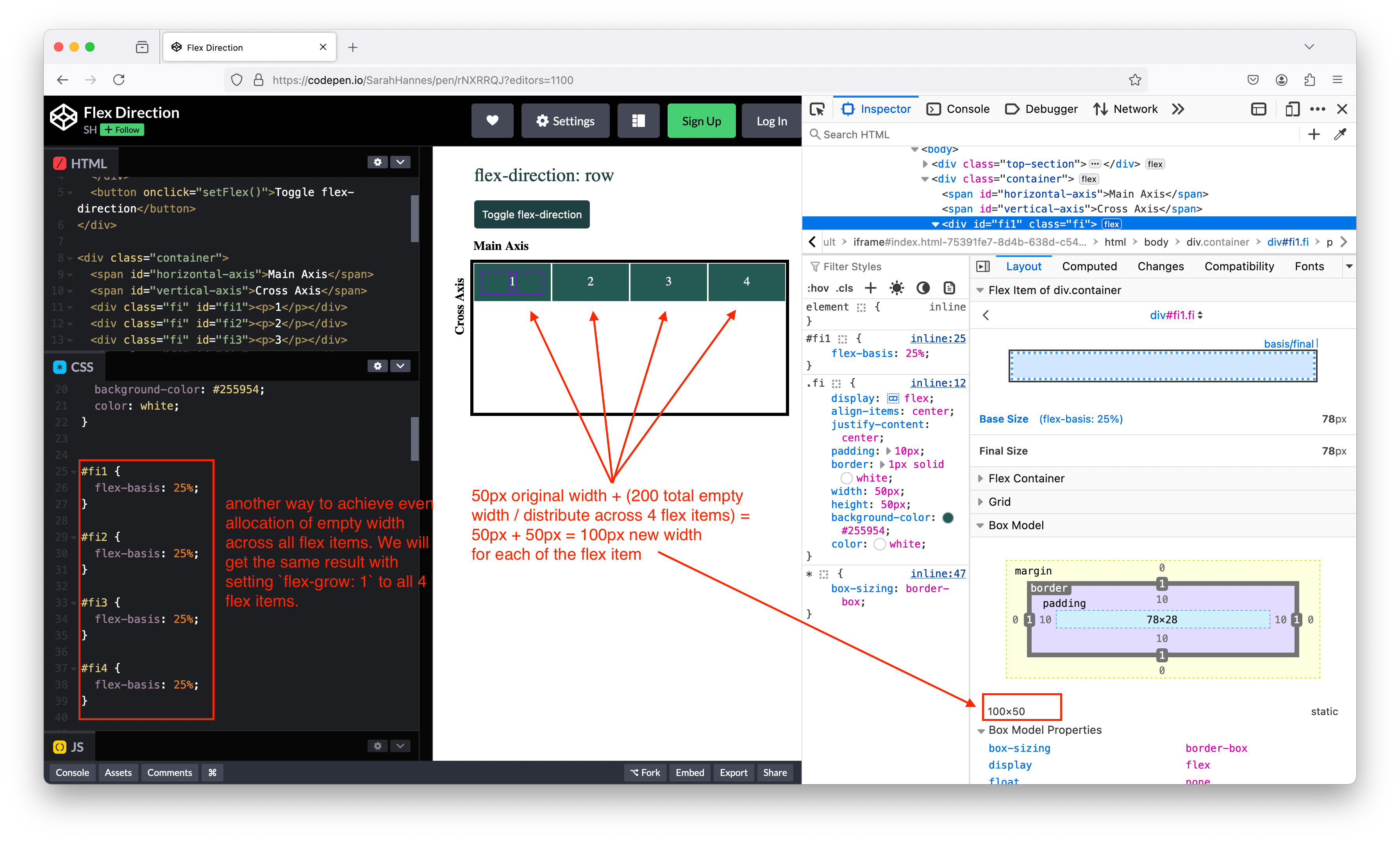
Reference
- MDN/Flexbox: MDN Flexbox documentation
- MDN/Flexbox Glossary: List of flexbox properties
- yoksel/Flexbox Cheatsheet: Interactive flexbox cheatsheet